User tabs and layout childs
The settings for user tabs and layout childs can be found in the global settings. This allows you to configure which tabs are available in the sidebar of the user shell and which shell components (layout childs) make up their respective windows.
User tabs
In the User Tabs tab of the global settings the user tabs of the sidebar can be configured.
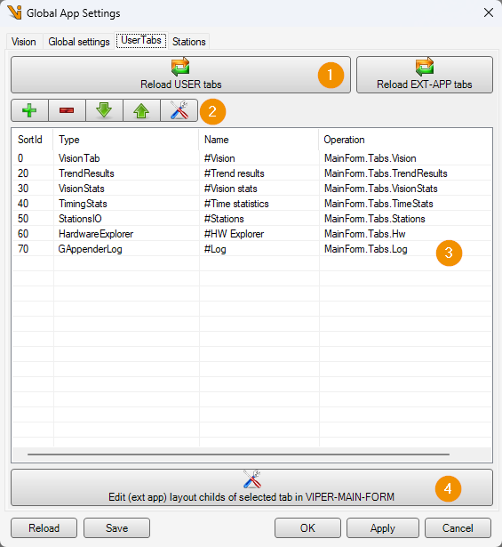
The Reload buttons (1) are used to update and reload the configuration files userTabs.xml and extAppTabs.xml on which the user tabs are based on with the current settings. The buttons below (2) can be used to edit the user tabs in the list below (2). When creating a new user tab, the type of user tab to be created can be selected from a list:
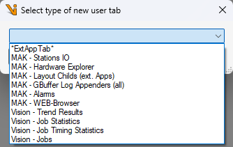
The types of user tabs available for selection depend on the loaded plugins, which can provide their own user tabs.
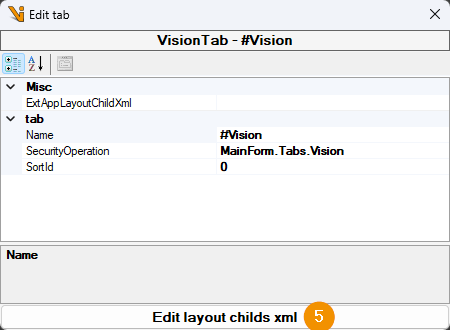
Die Layout-Childs, die innerhalb eines User-Tabs angezeigt werden sollen, lassen sich mittels des Edit-Buttons (4) für den aktuell in der Liste (3) selektierten User-Tab konfigurieren oder mittels eines entsprechenden Buttons (5) in den User-Tab Einstellungen. Diese lassen sich mit dem Editier-Button der Schaltflächenleiste (2) oder durch Doppelklick auf einen User-Tab der Liste (3) öffnen.
Layout Childs
Layout childs are various interface elements that can be arranged within a user tab. The layout child settings can be opened in the User tab settings.
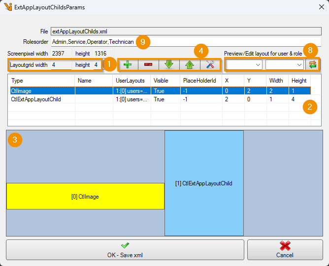
The size of the grid (1), within which the layout childs of a user tab can be arranged, depends on the display layout of the user tab. The display layout of the vision user tab, for example, can be configured in the type management. The configured layout childs are displayed in the list (2). Their position and size within the display layout grid is visualized in the display below (3). The layout child selected in the list is highlighted in the display in yellow. Layout childs can be added, removed and edited using the button bar (4). As with the user tabs, a selection of different types is offered when creating new layout childs, which can be extended with plugins. The settings menu of a layout child can also be opened by double-clicking in the list (3) or the graphical display (4).
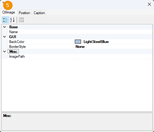
The settings menu of a layout child contains a tab with specific setting options (5) that depend on the type of the layout child.
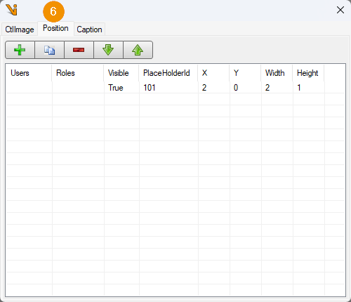
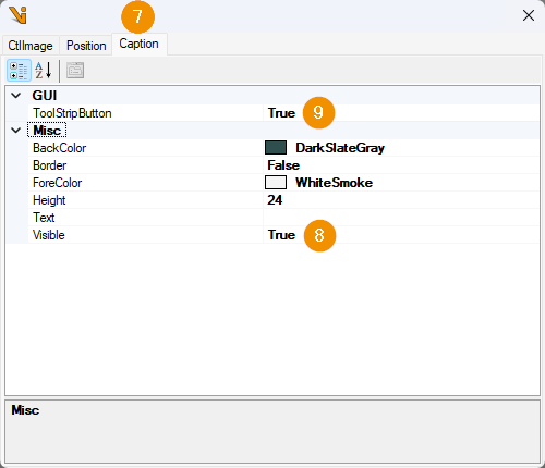
In addition, the settings menu always contains a Position tab (6), in which the position and size of the layout child within the display layout grid of the user tab can be configured, as well as a Caption tab (7), in which a title bar (8) for the layout child with optional tool strip menu (9) can be activated. Which entries the tool strip menu will contain depends on the type of layout child. It is generally advisable to activate the title bar, as this allows you to maximize layout childs by double-clicking on them.
Different layout childs can be displayed to different users or user roles in a user tab. To do this, several positions or sizes are created in the Position tab of the layout child settings (6). Which of these configured settings is visible in the visualization (3) can be controlled using the drop-down buttons (8). As several roles can be assigned to a user at the same time, it is necessary to define which role definition has priority when displaying layout childs. This is done using the Rolesorder field (9).